
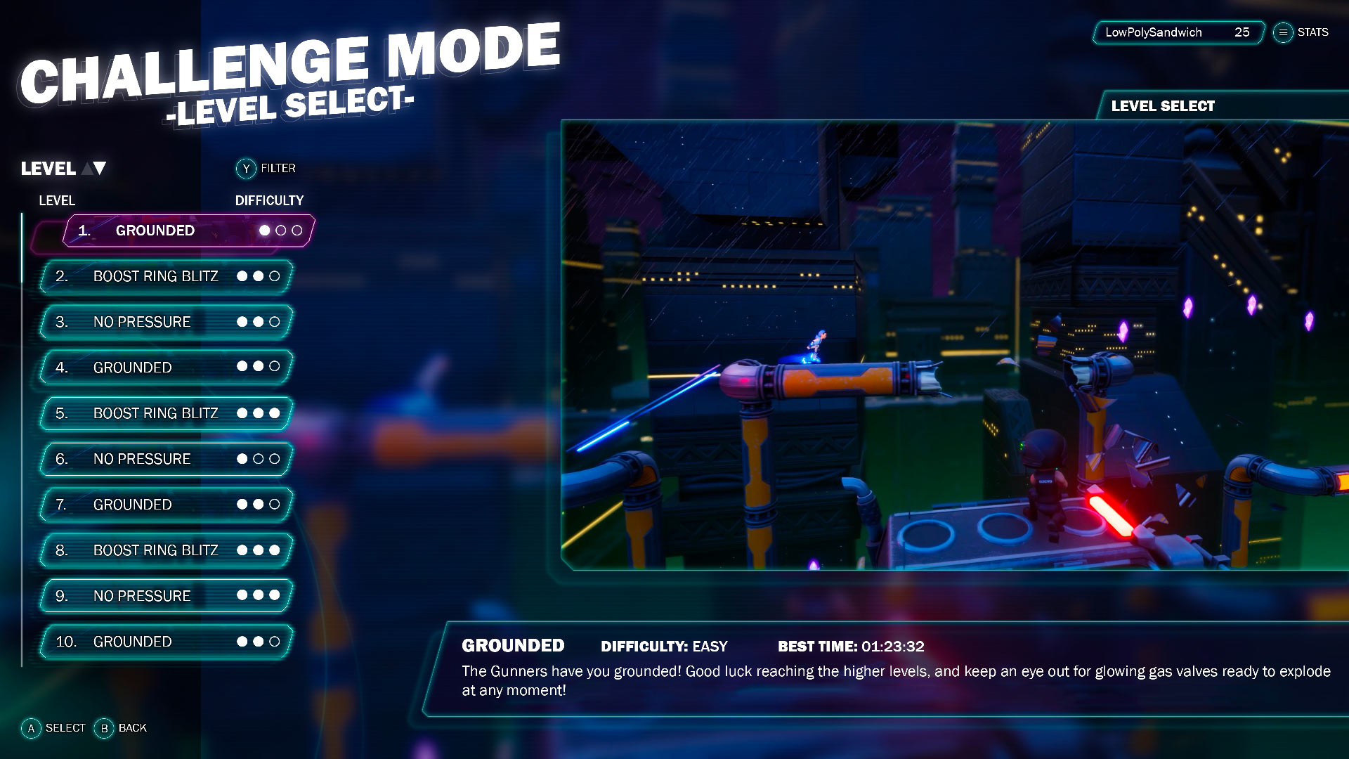
image caption It took many stages of iterative design to end up here — and it's changed more since!
Today, I'm going to share with you the process I used when concepting and creating the final menu design of Rooftop Renegade. This game has gone through a lot of menu changes. Instead of designing one properly from the start, I would quickly create a new one for any upcoming event such as AVCon or a play test. This means I was never happy with what I made until I spent a few weeks designing one from scratch and getting plenty feedback along the way.
It's important at every step of this process that you "always be referencing'", as my Environment Art Lecturer would say. When you're creating your initial list of menu screens you will need, you may not be thinking about how each screen will flow, or if the text will be readable against a moving background. Find suitable references every step of the way when creating your UI.
When creating UI, don't feel as though you need to reinvent the wheel — in fact, it may be better that you don't. When dealing with human interaction, it's best to go with what works. Players don't necessarily want to learn a new system for your game alone. Believe me, we had many play tests and surveys to nail down what we have now. I'll break down how I made the menu in Rooftop Renegade into stages below.
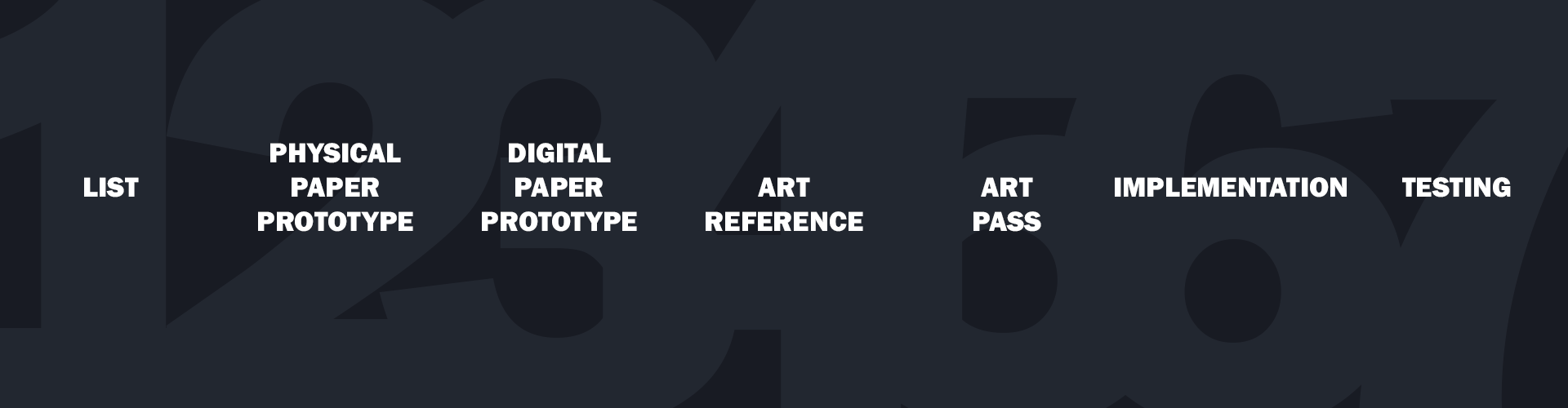
image caption Lists, physical paper prototype, digital paper prototype, art reference, art pass, impementation and testing.
By the end of this stage, you should have a good idea of how many screens you will need and how similar games structure their menus.
The first step to creating your awesome menu is a to create a simple list of all the pages/screens you think you're going to need. This list will get long very quickly and it will change all the way through the design process. Begin by looking at similar games, and taking note of what screens they use. Does your game have various modes? Chances are they'll require separate screens. Be liberal with the screens you choose. Pick 60 and whittle it down to 40 if need be, this first stage is to get you comfortable with knowing what's going into your game.
Find a game your game is similar to. For example if you're making a first-person shooter, what are the most popular current FPS games? How many screens between 'press A to start' and when the player is in a match? If possible, consolidate where you can - this will become apparent in the nest stage if you have too much or not enough on your page.
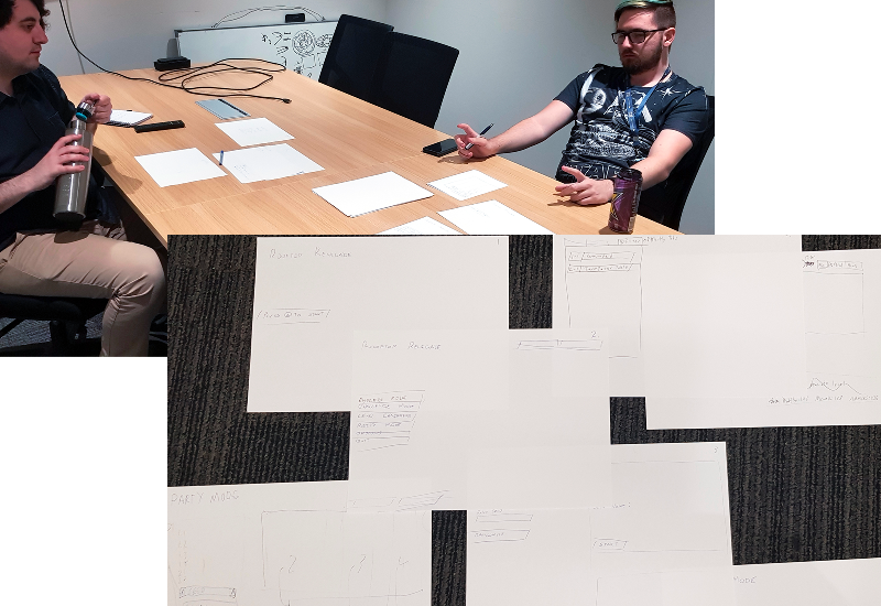
image caption The team working out the paper prototype.
By the end of this stage, you should have a clear idea of how each screen will flow into the next.
After you have your list create a physical paper prototype. Get some A4, or some post-its, and write down each screen per piece. It doesn't need button designs or areas for images, that will come later, right now you're just visualising your list of screens. Spread out on the table or on the floor. This technique will allow you to move screens around, visualise the flow of screens and help you realise which screens are necessary. Does your chosen flow have logic? Does the player have to click through too many screens to start a game? Did you factor in an options screen and how many screens will it require?
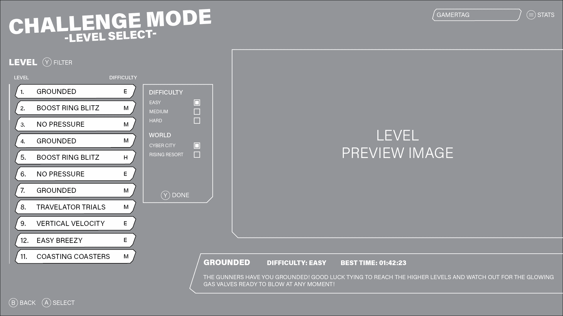
image caption The menu as we know it is now starting to come together.
By the end of this stage, you should have a digital mockup of your menu.
You now know how many screens your menu will consist of and how they'll all flow together, time to digitize it. The digital paper prototype is where your design begins to get granular and is really the fundamental art pass - how will all the elements on each screen fit together? What dimension is your screen? How big will each element be?
It's a good idea to work in the highest resolution your game will be presented in. For Rooftop Renegade, I know that eventually we'll want 4k support, so I made all my assets at this size and scaled down.
Open up your favourite design program. There's a bunch out there such as Adobe XD, Figma and Pencil to name a few. I started my UI journey before Adobe XD was a thing so for this project I used Adobe InDesign, which isn't developed for paper prototypes, but has the tools to get the job done.
Your chosen platform for your game will impact your UI whether it is mobile or PC/console. While most devices follow a 9:16 (portrait for mobile) to 16:9 (widescreen or rotated for mobile) ratio, now is the stage to decide how yours will be locked. For example, when developing for mobile, a hand holding a phone has less precision than a mouse pointer, so your buttons will need to be larger.
An overlooked/underappreciated step to UI design is screen padding. This is the gap between the edge of the screen and the first element. Too much padding and your menu looks baby-proofed, not enough and everything looks crammed. For a 1920x1080 resolution somewhere between 30 to 60px should work.
Next, you'll want to determine your font size and weights. Hierarchy is probably the single most important part of UI design to make sure players understand the information you're conveying. Follow a web design process of H1 (heading one), H2, H3, H4 and P (paragraph) for your design. H1 is only to be used once per screen, so this is reserved for the screen title. If you're making a mobile game with a single screen H1 may in fact be your game logo. H2 is for your sub titles such as titling a section of your screen like 'levels'. For Rooftop Renegade I used: H1 120px and H2 55px for an intended screen size of 3840x2160.
Now is also the stage to determine how big your buttons will be. As previously mentioned for accessibility, for mobile games your buttons need to take up more screen space than they would for PC/console. Begin thinking about what styling you will use in your art pass to differentiate text from buttons. Use this step to determine how much room your buttons will take up, along with any other imagery.
The menu for Rooftop Renegade is always left-aligned. I designed this to begin training the player to focus towards the left side of the screen where the runner will be in game. The consistency between screens really helps tie the design together.
Hopefully you've been referencing various video game menus during the process and have started to formulate an idea of how your menu will look.
Begin by picking a palate that will work for your game. Rooftop Renegade, for the most part, uses a dark palate for its backgrounds and bright colours for its foreground gameplay to help players focus. The menu employs this method too, using a dark background, and bright colours and white text for interactable elements. Rooftop Renegade is also a neon sci-fi game so bright colourful UI on top of a dark background is a trope players are familiar with.
Remember, your menu sets the stage for your game. If Halo used the Kirby 64 menu design it would confuse the player and the misalignment in style and flow would make the game feel unfinished.
image caption We've come full circle and the menu is complete — for now!
You now have a solid idea of the screens you will need, how you will lay out each screen and have adequate reference from other video games. Now begins the fun part - create your own art! Whatever program you decide to use, Photoshop, Illustrator, GIMP, make sure you work smart and can use the assets you make now in your final game.
Using the measurements from your paper prototype, begin with defining the tone of the background of dark or light so you can choose the colour of your text. While games are not held to the same accessibility standards of websites, it's a good idea to ensure there is enough contrast between your text and background. A tool such as accessible-colors.com can help with this.
When designing your buttons, remember you'll need 3 state changes: standard, hover, and active so the player can easily see where the focus is at any given time. When designing your buttons, you'll probably create different shapes and sizes. In photoshop you can create a 'layer style' that can be applied to any other layer. Rather than working destructively, layer styles let you change the shape and will reapply the style, rather than designing a new outer glow every time.
You've designed your menu, you picked a colour palate and you have all your art assets, now you can begin to build the real thing in your game engine of choice. The first thing to take note of is 'what can be achieved in engine?' Both from its benefits and its limitations.
As mentioned previously, your buttons will require three states to convey give feedback to the player when they press a button. Perhaps a hue shift can achieve this effect? If so, instead of importing two separate textures with different colours into engine, import one and create multiple materials for a 'hover' and 'pressed' state. This way, you're saving on file size (a whopping 30kb!) but more importantly, any changes can be made quickly in engine without needing to reimport - especially handy if you work with external, or contract artists.
The same is true for text, not just for a file size or ease-of-life reason, but rather for accessibility instead. It's very tempting for new designers to create a button with text in photoshop and export it as an image. The problem is, if you want to localise your game for another language, you now need to create a separate image. This will add up after 100 buttons, when you could just create different data sets in engine with text referring to each language.
However, game engines do have their limitations. For example, Unreal Engine does not support glow on text. This is because glow or 'emissive' is handled as a post-processing effect and UI elements are not subject to post-processing. It made no sense to me when our programmer, George, told me it wouldn't be possible without a custom font set. 'But CSS just blurs the pixels by a certain amount!' I cried. "Welp, this isn't CSS' replied George. Have a plan B in mind in case your designs aren't feasible.
If you're using Unreal Engine 4, I highly recommend checking out George's blog on UMG and Gamepad Navigation.
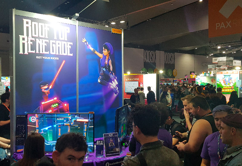
image caption The most rewarding part; player feedback!
Woo! Your menu is complete! You have all your screens laid out, designed and implemented in engine! You are (or you have) an excellent programmer and everything is working correctly. Go get yourself a cornetto out of the freezer. Oh wait, did you test it with someone else? Does your menu make sense to someone who doesn't play your genre of game?
Testing is always the heart breaking moment for artists, programmers and producers. "But I understand it, maybe you're using it wrong?" Well, considering these are the people who may end up buying your game, chances are the menu is hard to understand.
I have put a lot of work into designing the menu for Rooftop Renegade. My first port of call is to check with the team. This is their game too, are they happy enough to have this menu in their game and can they understand it? In a small team it's important everyone feels comfortable to say "I don't think this is right". One of my early designs had the buttons too large "It looks like a mobile game" said one of the team. It took a couple minutes, but I finally saw it. It was a bit upsetting, I really liked the funky style. However he was right, the buttons were too big.
As you get more comfortable with sharing your designs you realise those are important moments. Critical feedback isn't an attack on you as an artist or a person. Usually you haven't taken the idea as far as you can, and it's important many relevant voices can be heard during the design process. And as always if you ever want feedback on your UI design or art, feel free to reach out to me on Twitter!
Alex
where to find us
Adelaide SA 5000
hours
join the mailing list
© 2022 Melonhead Games
social media
facebook instagram twitter youtube snapchat LinkedIn